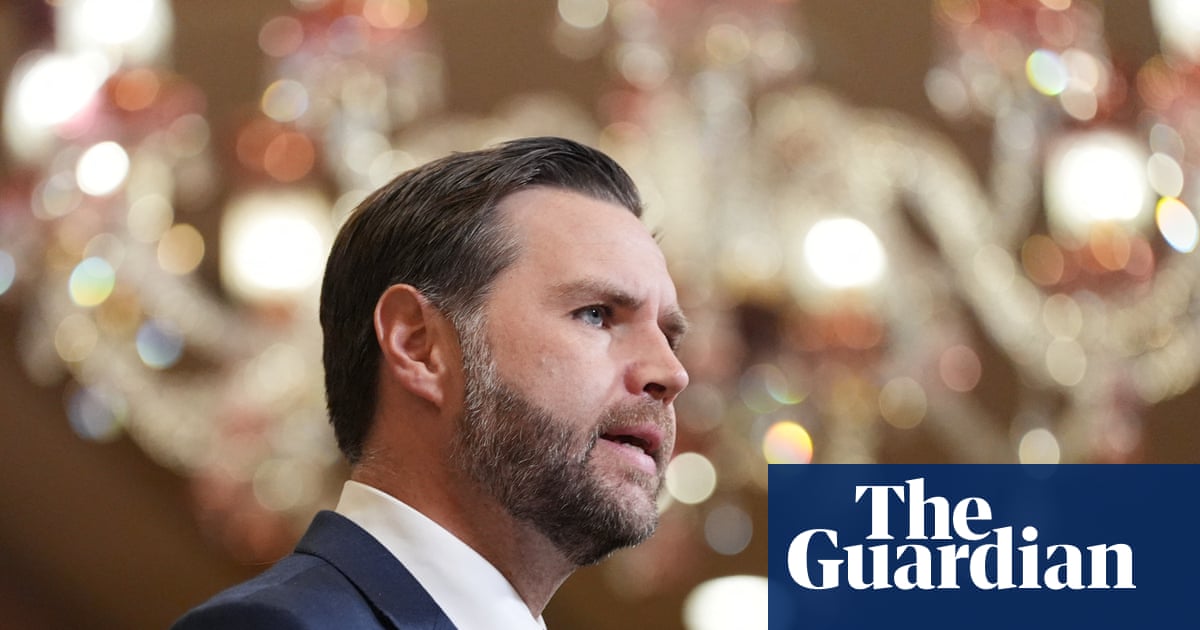
Hot off of overseeing the fall of the Orban regime, failing to secure an unlikely peace with Iran, and, as far as I can tell, killing the last Pope (that one’s probably not completely true), Trump attack dog J. D. Vance is back in the news, lambasting the (new, as-yet-unkilled-by-him) Pope for not staying in his lane regarding the US war on Iran.
Quoth Vance, himself a Catholic convert:
It would be best for the Vatican to stick to matters of morality, to stick to matters of what’s going on in the Catholic church and let the president of the United States stick to dictating American public policy.
Really?
For the last half-century — arguably since the founding of the US, but I’ll focus on politics-as-I-remember-it — the conservative right has been asserting, if not demanding, that morality should be and must a key component of public policy. Every discussion of sexuality, of civil rights, of reproductive freedom, has had the evangelicals, the GOP, and the Right in general demanding that morality is intrinsic to decision-making and actions. Hell, every argument still being made about gay marriage, or trans rights, or what books shouldn’t be in the library are still framed as moral issues.
And, of course, they were right.
All actions have a moral dimension to them — in how we interact with and treat ourselves, our world, and each other.
The same is true of government action. Public policy does not occur in a moral vacuum (that, itself, would be a course with moral implications). If an action affects individuals, groups, people in general, morality comes into play.
The catch, of course, is whose morality is expressed in such policy. If I want a book to be banned, that’s my moral judgment being asserted. If I want a book not to be banned, that’s founded in morality as well. In either case, I want what is “right,” what is “best for everyone” (or for “the children” or for “intellectual freedom,” or for …).
That expression of morality gets resolved at a micro level in this country through the democratic process — elected officials and (directly or indirectly) elected policy makers making decisions, passing laws and regulations, and applying those to given circumstances. At a macro level, that’s done within the framework of existing laws, up to state and federal constitutional restrictions on what government can do and why. And even that level can be changed through direct and indirect democratic processes.
In other words, Vance’s attempt to draw a bright line between the Pope handling questions of morality and the Dear Leader handling questions of public policy is nonsensical.
Indeed, the Trump administration has been explicit in trying to assert (or assume) a moral case for the Iran War. Look at Pete Hegseth gleefully foaming at the mouth as he quotes the Bible about God crushing evil-doers. Look at Trump talk in semi-coherent terms about the Iranians (or their leaders) being “not good people.”
Look at Trump pretending to be Jesus, surrounded by soldiers and fighter jets and angelic warriors …

I’m pretty sure morality is being expressed there. As well as a bit of blasphemy and a lot of poor taste.
Even the fundamentally lucid arguments about the war — keeping Iran from becoming a nuclear power to protect the lives of potentially millions of people — assume a moral position of “protecting (some) innocent lives is good.”
And it is good. Protecting the Middle East, and the world, and ourselves from a government that has actively used terror as a policy tool coming into possession of nuclear weapons — that’s a (defensible) moral goal. Freeing the Iranian people of a theocratic regime that has ruthlessly and bloodily oppressed its people — that’s a (fraught but also defensible) moral goal as well.
Of course, how one goes about such actions, as well as an analysis of other reasons why one pursues such a course — those are questions of morality, too. Lobbing Tomahawk missiles and sending stealth bombers to blow up Iranian military targets and anything that happens to be around them — that has obvious moral implications. Threatening, even as a negotiating tactic, to destroy civilian infrastructure, to bomb a country “back to the Stone Age,” to “end a civilization” … I’m pretty sure there are moral components there, too.
For Vance to suggest that one can (and, by implication, that his boss has) separate “matters of morality” from “American public policy,” and that the Pope should stick to the former as his lane and shut up about US military actions, is so misguided as to be disingenuous. Vance is smarter than that. Trump, maybe, can’t juggle those concepts (especially as his fundamental morality seems to be “If I want to do it, it’s okay”), but Vance knows better, including here:
The president has the prerogative to set American foreign policy, he’s got the prerogative to set American immigration policy. He has to look out for the interests of the United States of America, and that inevitably means that when the Vatican comments on issues of public policy, sometimes there’s going to be agreement, of course, and sometimes there’s going to be disagreement.
The President does, in fact, legally have the prerogative about such policy (though he is bound by law and the Constitution as to how he goes about pursuing those policies). That doesn’t mean they are independent of morality, as Trump’s very statements about them show otherwise. Pope Leo isn’t suggesting that the President of the United States must obey him, that the Papacy has authority over American policy. He’s doing his job — calling out his evaluation of the (im)morality of actions take under those policies.
After spending all that time trying to draw an artificial line between Trumpian policy and questions of morality, Vance’s conclusion?
When they’re in conflict, they’re in conflict. I don’t worry about it too much.
Hey, J. D., given your boss’ ongoing attacks on the Pope …

… I think he is worrying about it a bit.